Beautiful Billheads
We’re all familiar with the business term “letterhead,” right? But what about “billhead”? I’ll confess I only learned the word a couple of months ago.
I had seen billheads before — often collaged into photos as black and white art that featured type, ornamentation, or handwriting — but I didn’t have a word for what I was seeing.
So, what are they? Wikipedia defines billheads as “receipts commonly used in business transactions from the late 1860s through the early 1940s … Many billhead receipts were illustrated and decorated with fancy steel engravings, while others carried no illustrations. In either case, the receipt was important, as it stood as your proof of delivery. Most billheads would bear the company’s name and address, a unique invoice number, the payment terms, line items for products or services, a total, and (optionally) handwritten notes.”
The name makes perfect sense, right? It’s like a letterhead, but instead of a letter, the page shows a bill or receipt.
During the previous weeks I’ve spent a bit more time looking at billheads. It’s far from an obsession; let’s just call it a passing interest. But the combination of ornate typography, detailed illustration, and old handwriting hits all the notes I enjoy about old ephemera.
Here are some common design motifs I observed:
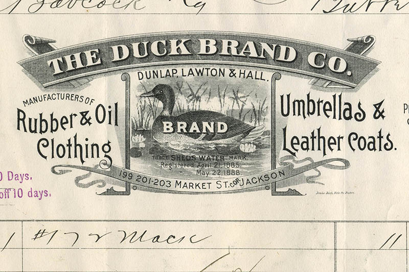
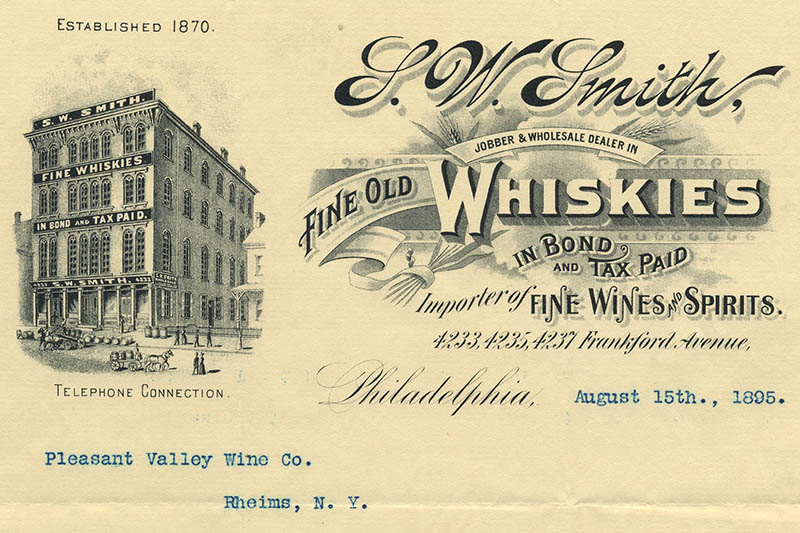
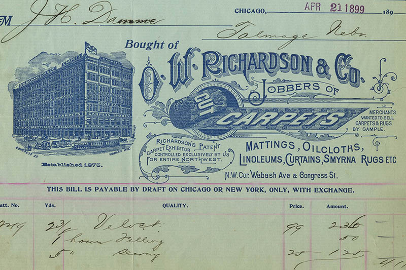
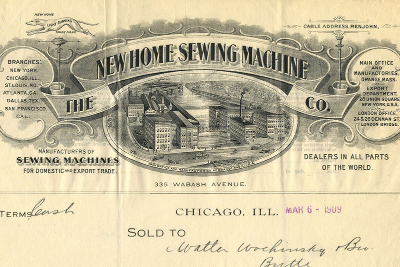
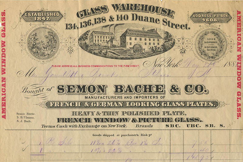
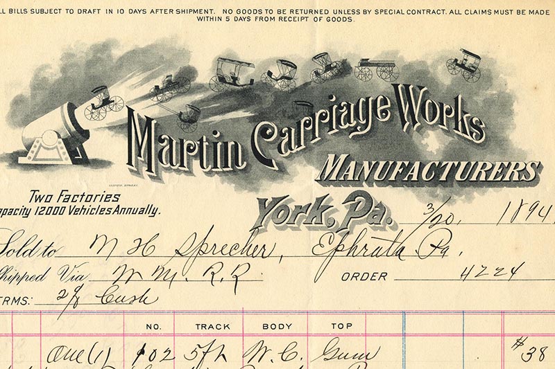
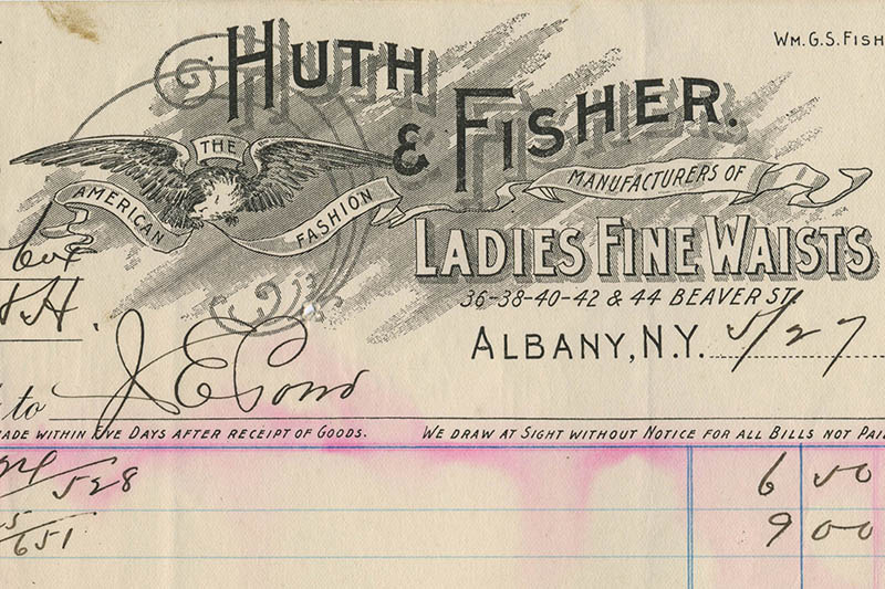
1. Buildings. Whether it be a single paddle-wheel-powered building, a row of factory buildings belching out smoke, or a multi-story store people can shop at in person, it seems as though showing a physical location was key to establishing credibility.
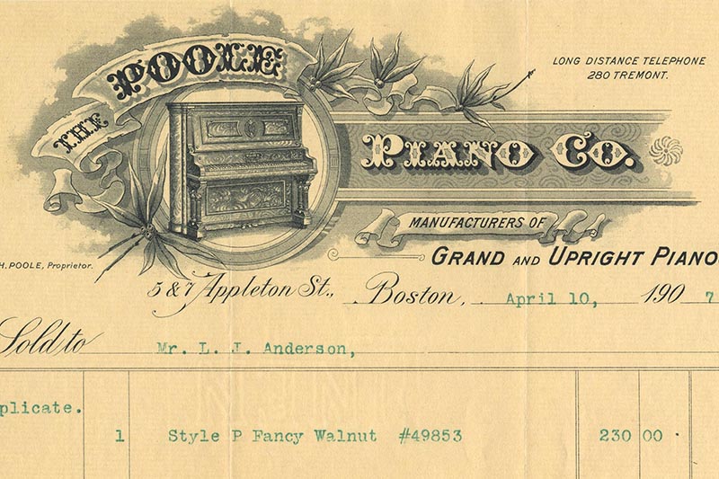
2. Illustrations that reflect the product, such as wheat, a carriage, a piano, or a rolled-up carpet. Considering 20% of the US population in 1870 was unable to read or write, I wonder if these images served as pictograms. Imagine a wealthy merchant sending illiterate staff to go pick something up: they would know they were bringing home a receipt for the correct item, even if they couldn’t read it. (Source: ourworldindata.org/literacy, “Literacy rates 1820–2010” which measures the share of the population older than 14 years that was able to read and write).
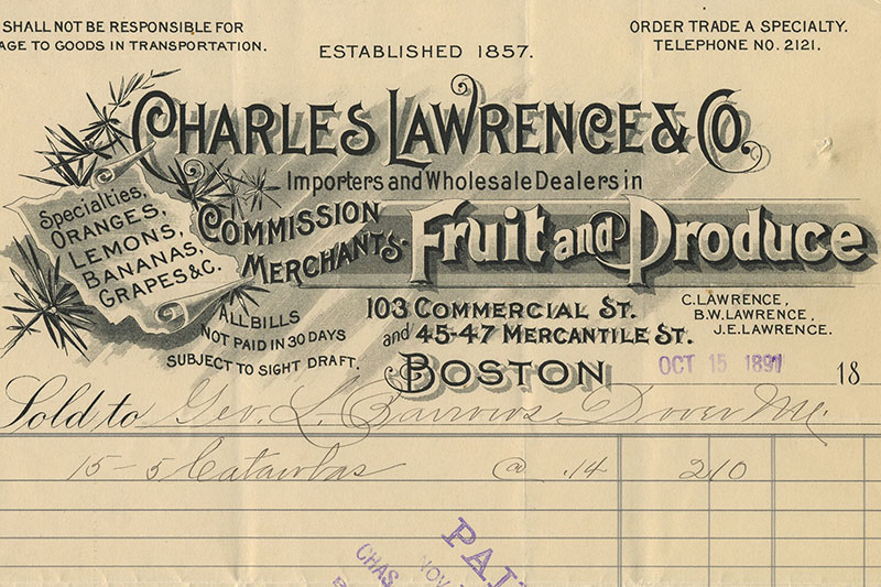
3. Cartouches that contain a list of products, addresses or categories of goods. These cartouches might be illustrated to look like stone or a scroll of paper or an ornamented banner. I was surprised by how many billheads contain these types of design elements. I was also amused at how random some of the product lists were.
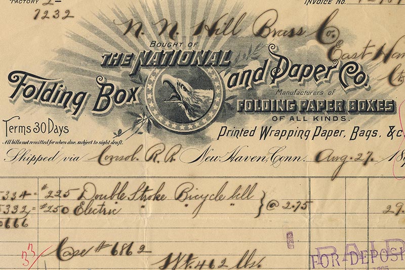
4. Patriotic imagery. I’m not sure what a screaming eagle surrounded by a ring of stars has to do with ladies corsets. But I suppose seeing that imagery makes sense: in the first full century of our democracy, architects and business/political leaders consciously chose to associate the nation with iconography that was reminiscent of classic Greek and Roman culture (think: laurels, shafts of wheat, formal symmetry, folds of ribbon). This is just a wild guess, but I wonder if this imagery would “Americanize” businesses founded by immigrants.
5. More is more. I am amused by how much “stuff” is on some of these billheads: addresses, lists of goods sold (croquet sets to iceboxes!), a list of owners or founders, founding dates, features, animals (check out the greyhound on the billhead for the New Home Sewing Machine). It reminds me of the Iris Apfel quote that is currently making the rounds: “More is More and Less is A Bore.”
What else do you see? Which one is your favorite?
P.S. My favorite is the billhead where carriages are being shot out of a cannon.