
Dissecting the book cover
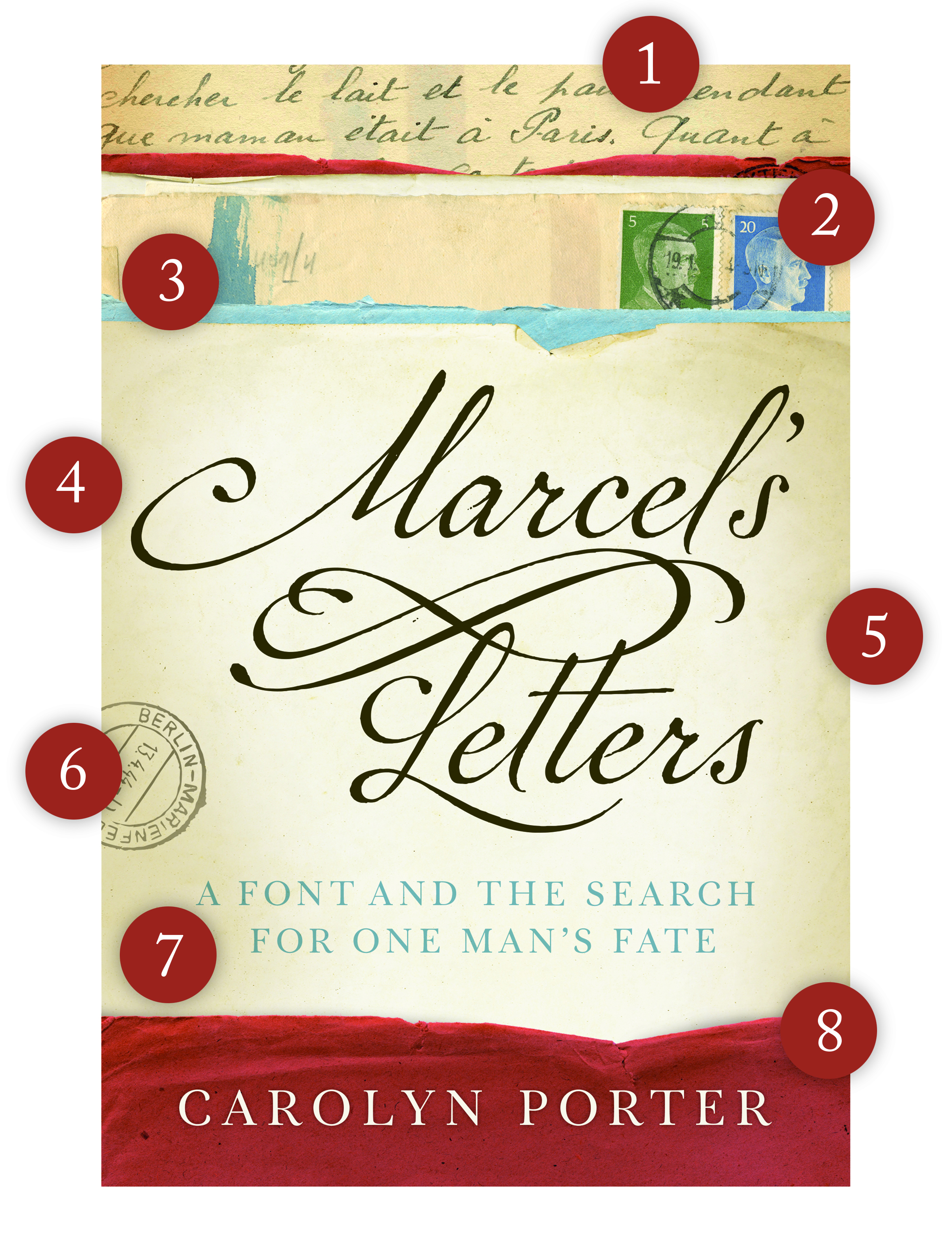
The book cover has been finalized! I’m delighted with the final product and am grateful for the work of the cover designer, Erin. I’ve heard people remark they like it; that it has “shelf-appeal.” What people may or may not understand by quickly glancing at the cover, though, is that it has specific design elements that work hard to tell its story.
1. A sample of Marcel’s writing.
Several of Marcel’s letters will be shown inside the book, but the images will only be in black and white. Having a sliver of his beautiful handwriting on the cover allows readers to see the watery quality of the ink. This specific sliver was selected because “Paris” can prominently be seen; the word provides a clue to the book’s setting.
2. The Hitler stamps.
These stamps immediately — and viscerally — place the letters in time. The envelope the stamps are adhered to was not from Marcel (his letters had been separated from their envelope by the time I bought them). But, this particular envelope was mailed by another forced laborer, so it is perfectly authentic to the place and time. (Where did this envelope come from you ask? Ebay!)
3. Painted blue and red stripes (the red is subtle; it’s to the left of the green stamp).
The painted stripes are mentioned in the first paragraph of the book. I won’t say any more; I don’t want to spoil anything!
4. The title.
“Marcel’s Letters” is typeset in the font P22 Marcel Script — the font based on Marcel’s handwriting. The sweeping “M” was the first thing that caught my eye about Marcel’s writing. The “M” is key to the story; it is mentioned on page two.
5. Aged paper.
I appreciate how the book cover designer found imagery of old paper — blue and red and shades of off-white — to collage together. I like how the folds and wrinkles make the paper look old and worn, and the fact the designer darkened the edges of the paper to help guide the eye to the title in the center.
6. Cancellation mark.
This cancellation mark was scanned from a postcard Marcel mailed in April, 1944. It was included here because it shows where he was writing from: Berlin-Marienfelde. The cancellation mark provides an additional clue to the book’s setting. For those who might not yet know, the book is set in Berlin, Berchères-la-Maingot (a village southwest of Paris) and White Bear Lake, Minnesota.
7. Tagline: “A Font and the Search for One Man’s Fate.”
The publisher tested several tagline variations before choosing this one. It’s succinct and identifies the story’s two storylines. Want to read more about the font Tryst? Click here.
8. A surprise.
It’s already on the cover. I promise. But, you have to get to the end of the book — or, more accurately, four pages from the end of the book — to find out what the surprise is.