
Typeface Choice and Publishing
 Last week, I had the pleasure of having coffee with White Bear Lake author David LaRochelle. He primarily writes children’s books, so our genres couldn’t be more different. But he has a 20+ year career as an author, and I had questions only an industry veteran would be able to answer.
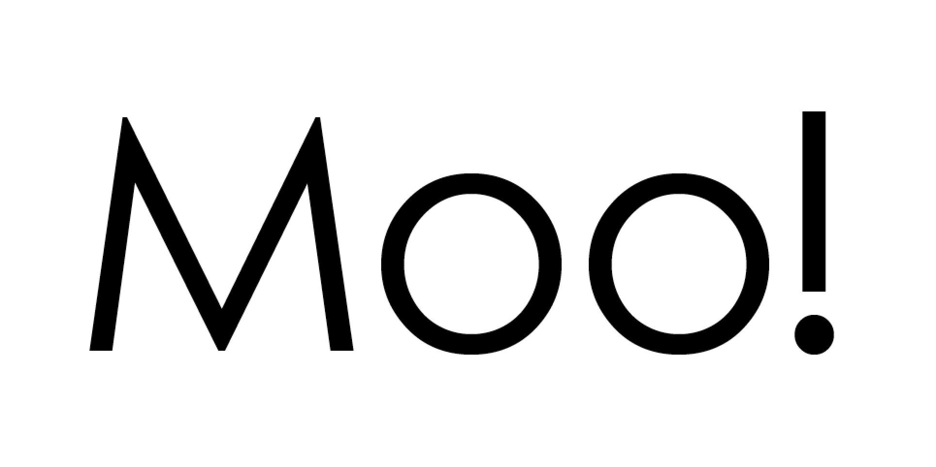
Our conversation meandered in a delightful way, and at one point we talked about typography. He explained the agony of picking the typeface for the interior of his most recent book, Moo! One challenge was the fact that “Moo!” is the only word in the book, so it had to look great. (Note: the cover has a hand-written “Moo!”). I asked which font they settled on, though David couldn’t remember off hand (I’ll give him a pass on that since he’s not a type guy).
Once I got back to my office, I had to look. FYI, his book is set in Century Gothic. It was a good choice!