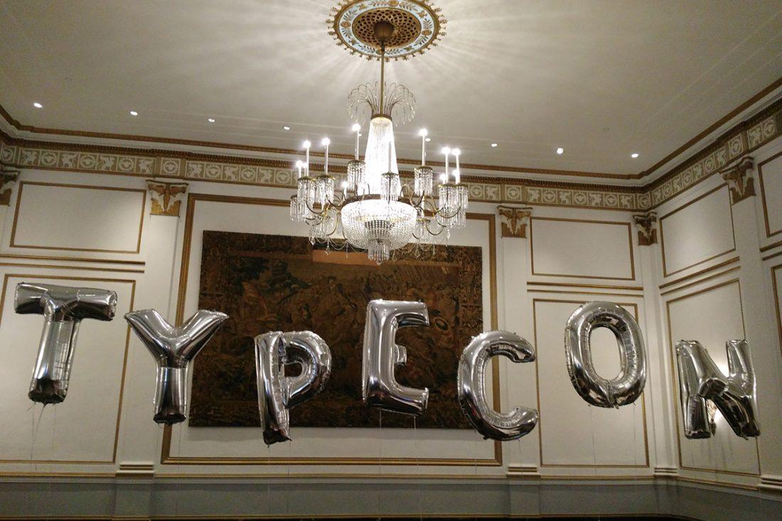
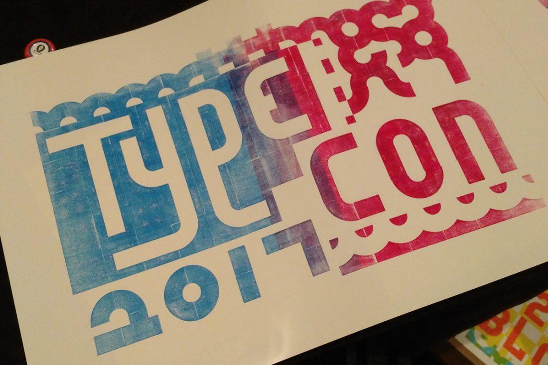
TypeCon 2017
I recently returned from five days in Boston attending TypeCon 2017, presented by the Society for Typographic Aficionados. It was five days jam-packed with lectures on type design, designers, type history, type across languages and cultures, along with time to connect with other type designers.
Highlights included:
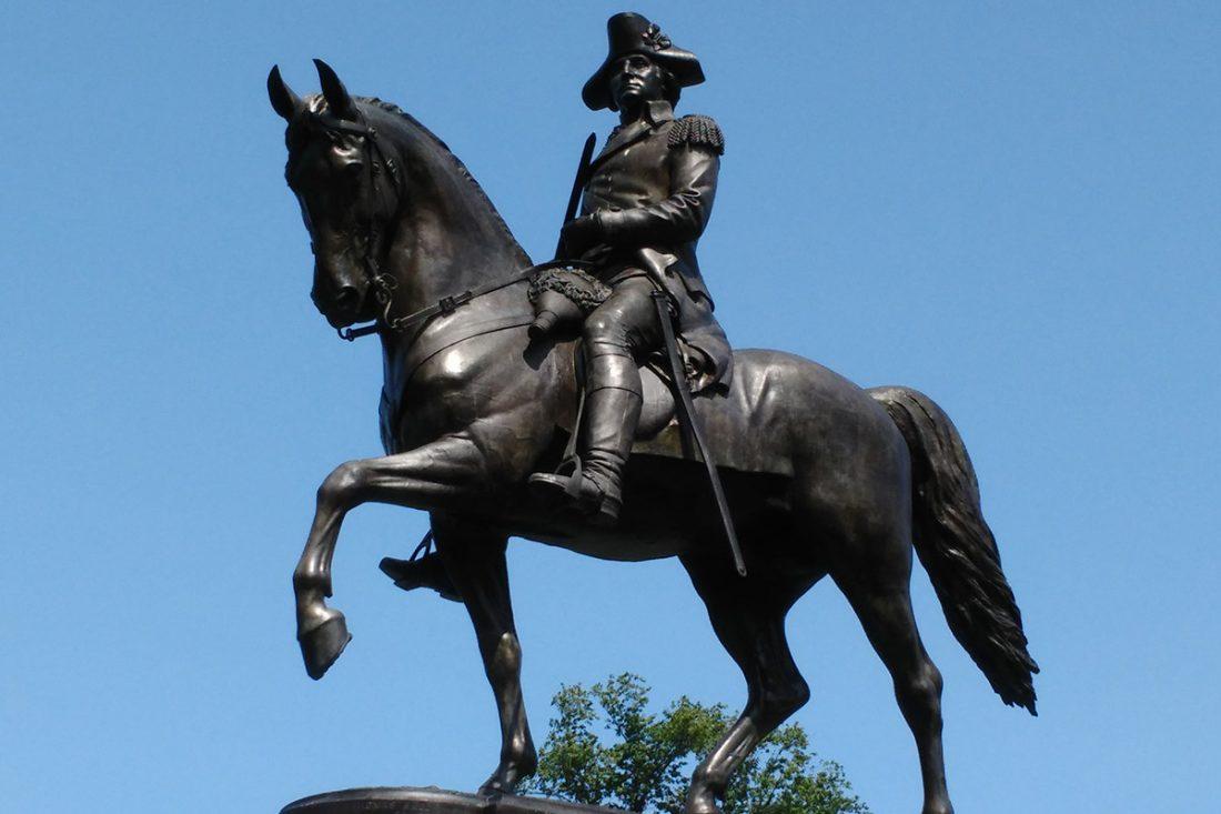
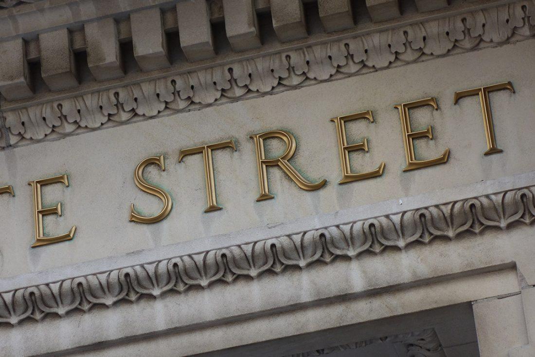
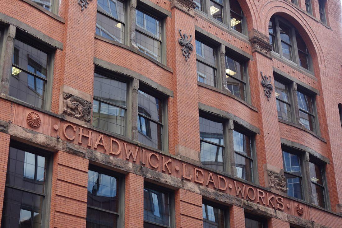
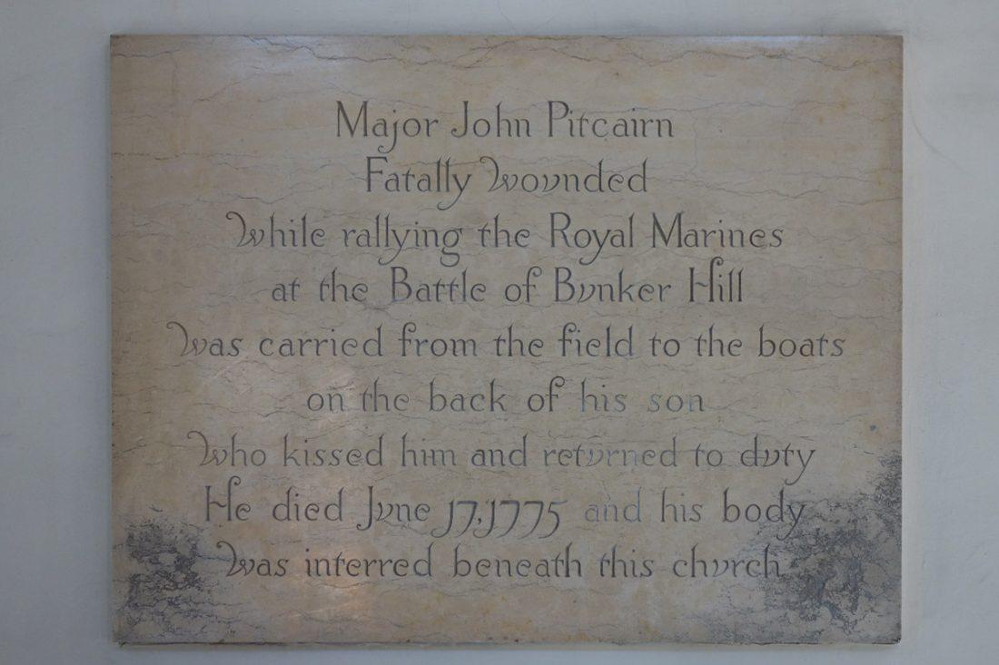
– A Boston “lettering walk” led by the incomparable Paul Shaw. We looked at lettering on buildings across downtown Boston. The most amazing building was the Chadwick Lead Works, a Richardsonian Romanesque building with fantastical dragons, squid, and ornamented terra cotta letters. Between conference activities I was able to squeeze in additional Boston sights, such as walking sections of the Freedom Trail and gazing at the beautiful Boston Public Library.
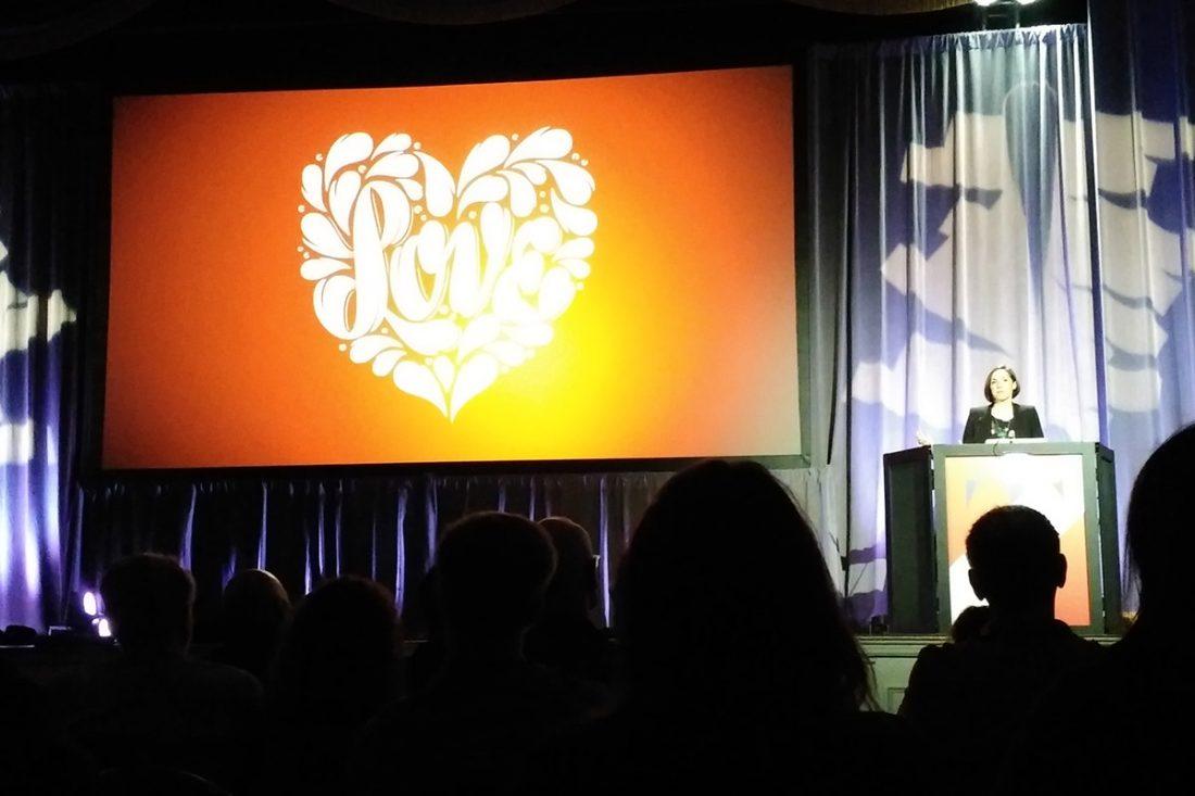
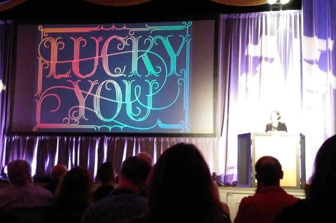
– The keynote lecture by the amazing Berlin-based lettering artist Martina Flor. She showed inspiring samples of her work and talked about her design process.
– Seeing expressive typographic illustrations by Alex Trochut (a shout-out to the New York Type Director’s Club for hosting Alex’s talk and for displaying the work of the most current TDC award-winners).
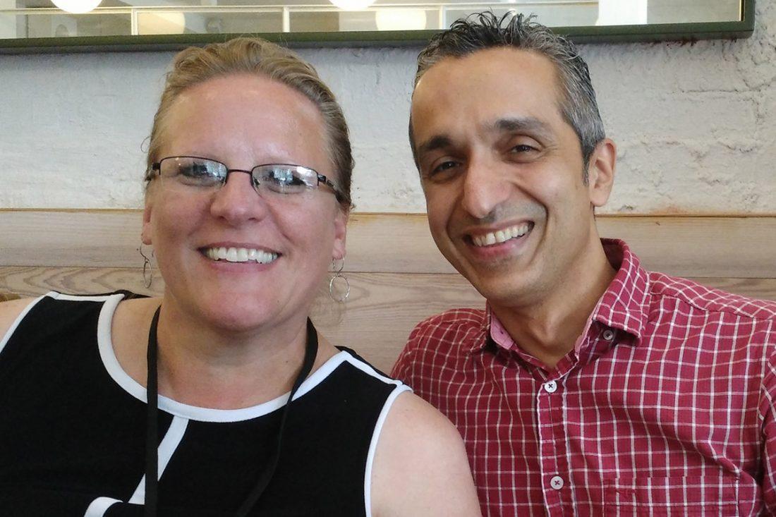
– Meeting some of my type design heroes/heroines! I even got to meet one of the developers behind the Open Type coding language (…though I’m still not sure if I love him or hate him for that).
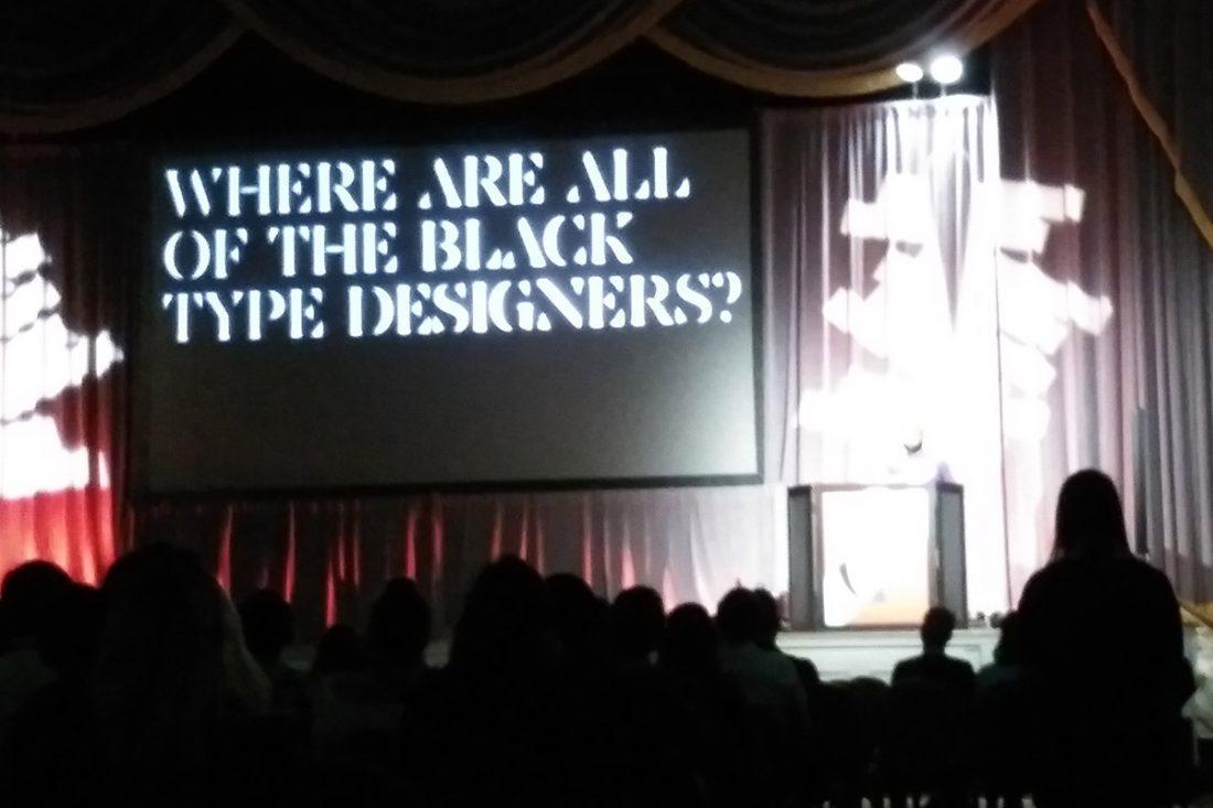
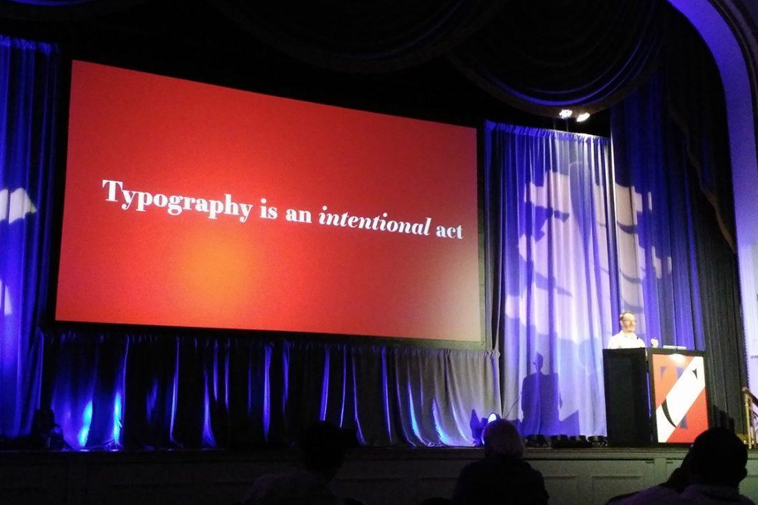
– Attending lectures by design industry leaders. Some talks were informative, others were entertaining, others asked tough questions about the industry, such as OCD’s Bobby Martin, who asked “Where are all of the black type designers?” A special shout-out to Mary Catherine Pflug for presenting the second annual Font Purchasing Habits Survey.
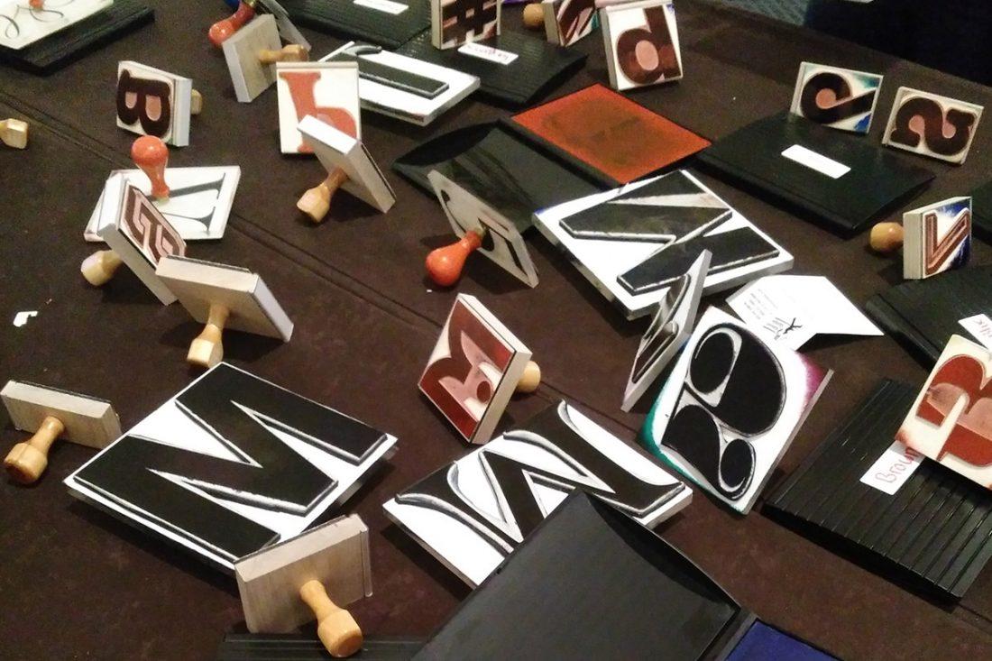
– A half-day class on FontSelf’s color glyph technology. It was good to start thinking about new font technologies, and how they might impact web and print design.
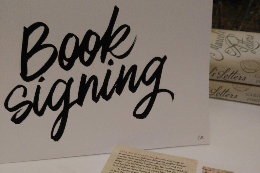
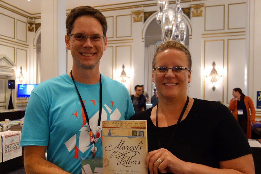
– A book signing for “Marcel’s Letters.” I know of two people who started reading the book during the conference; both cursed me for keeping them up too late! (Sorry, not sorry—I was happy to hear they couldn’t put the book down!)
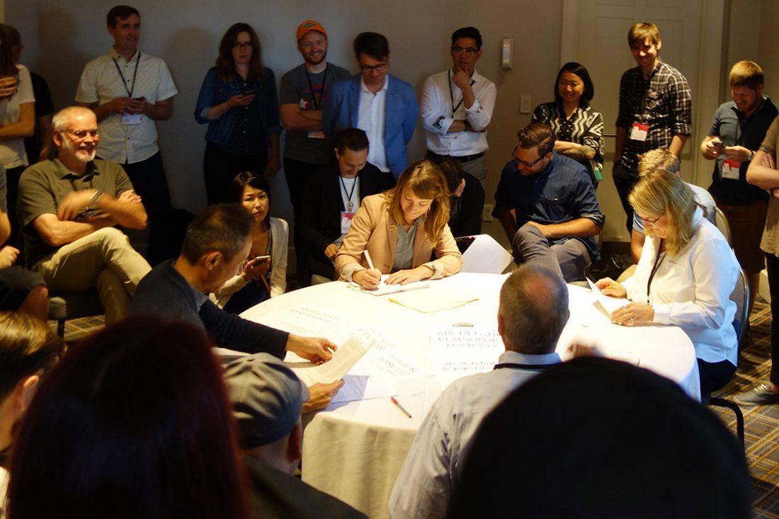
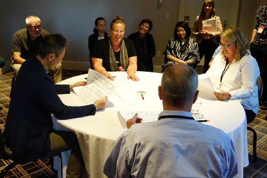
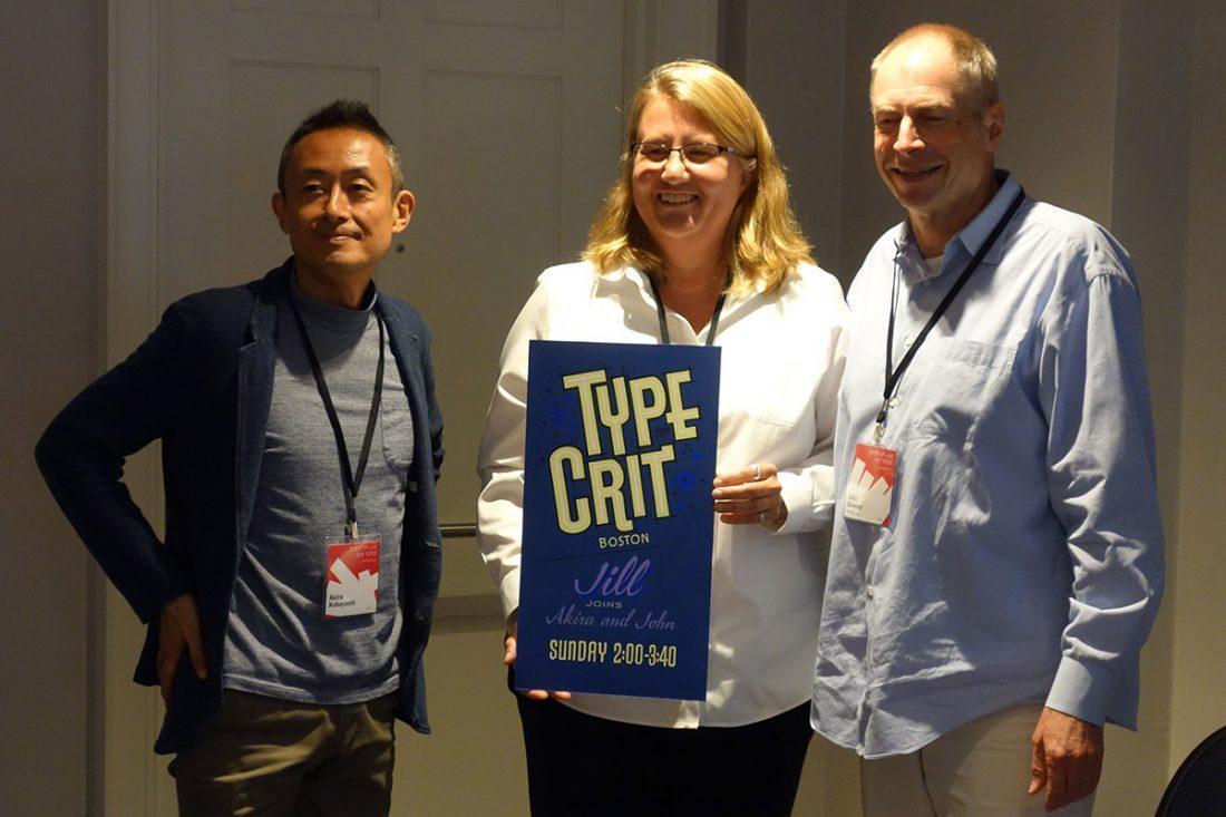
– A highlight of any TypeCon afternoon is the Sunday-afternoon Type Crit. This year, a few empty slots remained for second-timers. I claimed one of the slots and showed a preview of my next still-in-progress connected cursive script. John Downer, Akira Kobayashi, and guest judge Jill Pichotta provided great feedback and lots of suggestions for improvement. All I can say is that Type Crit is MUCH less terrifying the second time around. In fact, it was fun!
Congratulations to Ramakrishna Saiteja of Bangalore, India, recipient of SOTA’s 2017 Catalyst Award.
Finally, a huge thank you to TypeCon committee, sponsors and volunteers. It was another great conference!