Tryst
This week, I am expecting to preview final artwork for the cover of Marcel’s Letters. I generally know what to expect; the final cover artwork will reflect a revised tagline and a few other small artwork and composition revisions.
The cover design includes the font Tryst, designed by Philadelphia-based designer Kosal Sen, owner of the foundry Philatype. I talked with Kosal last week, and learned that Tryst was inspired by the letterforms of 18th-century type design master John Baskerville.
I also learned — and this is the part I love the most — that love is infused into every glyph of Tryst. “Tryst” is named after Kosal’s wife, Tristanne. Knowing this makes me like the font even more.
What’s the story behind the font you’re using (on your book/in your design/in your marketing materials)? Do you know? If not, it might surprise and delight you to learn the font’s backstory.

Photo: Kosal and Tristanne Sen
– – – – – – – – – – – – – – – – – – – – – – – – – – – – – – – – – – – – – – – – – – – – – – – – – –
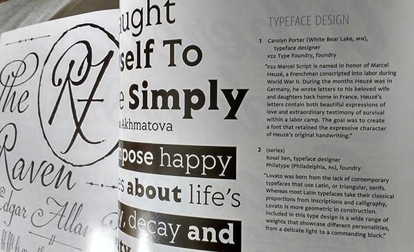
January 27 addendum! After this blog was posted, Kosal discovered we had a previously unknown connection!
In the January 2015 issue of Communication Arts magazine our fonts were featured on facing pages — and captions about our two projects were right next to each other. How cool is that?