A Drop of Ink, A Drop of Persian Culture
One thing I enjoy about TypeCon, the annual conference hosted by the Society of Typographic Aficionados (SOTA), an international organization dedicated to the promotion, study, and support of typography and related arts, is the opportunity to take workshops. Workshops provide an intense, hands-on way to learn something new from experts; this year’s workshops included an intro to Chinese calligraphy, a wood type printing primer, instruction on the construction of brush majuscules, an introduction to Hangul (Korean) type, reduction block printing, hot glass experiments (attendees got to make a neon letter!), and a day trip to the Hill Manuscript Museum in St. Cloud.
The workshop I signed up for was “A Drop of Ink, a Drop of Persian Culture,” taught by Maryam Khaleghi Yazdi, a design professor from University of Minnesota–Duluth. Maryam is originally from Iran and has designed three Farsi/Arabic typefaces: Khalaat, Vejahat, and Tasleem (see them here).
I’ve never studied Persian calligraphy before. I came to the workshop knowing nothing beyond the fact Arabic reads from right to left and that some letters connected. Over the years I’ve seen exquisite samples of Arabic calligraphy and I was curious to learn more.
Maryam began by explaining the differences between the various styles of calligraphy. Kufic script is primarily used in the Quran; Sols, which has a strong vertical stress, is common across Arabic countries; Bannei is more geometric, can be adapted for use in tile, and is often seen on buildings.
The style of calligraphy Maryam teaches is Nas’taliq. “Nas’taliq is the most popular contemporary style among classical Persian calligraphy scripts. … This calligraphy style has such a strong structure that it has changed very little [in seven centuries]. Nas’taliq is the most beautiful Persian calligraphy style and also technically the most complicated. It has strict rules for graphical shape of the letters and for combination of the letters, words, and composition of the whole calligraphy piece as a whole. Even the second popular Persian calligraphy style, “Cursive Nas’taliq” or “Shekasteh Nas’taliq,” noticeably follows the same rules as Nas’taliq, with more flexibility.” (Source)
In Iran, Maryam explained, Nas’taliq is preferred over Sols because the Persian aesthetic preference is for rounded, expressive letterforms. Nas’taliq is ideal for poetry and other lyrical writing.
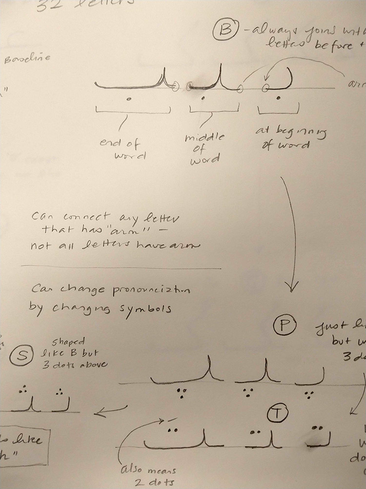
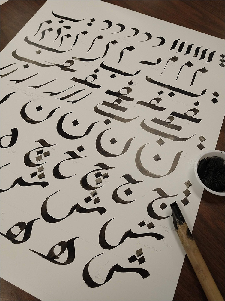
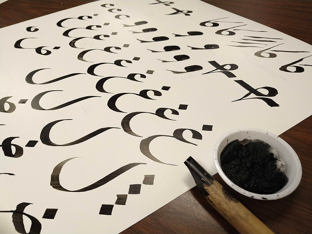
Next, Maryam walked us through the alternate forms for the 32 letters of the Farsi/Arabic alphabet. Most letters come in four variations: when a letter is at the beginning of a word, when it’s in the middle of a word, when it is at the end of a word, and when it stands alone. It’s not entirely different than how letters written in cursive might vary based on position. It was also interesting to learn that the letters B, P, T, and S differ only by the number of, and placement of, dots above or below the horizontal strokes.
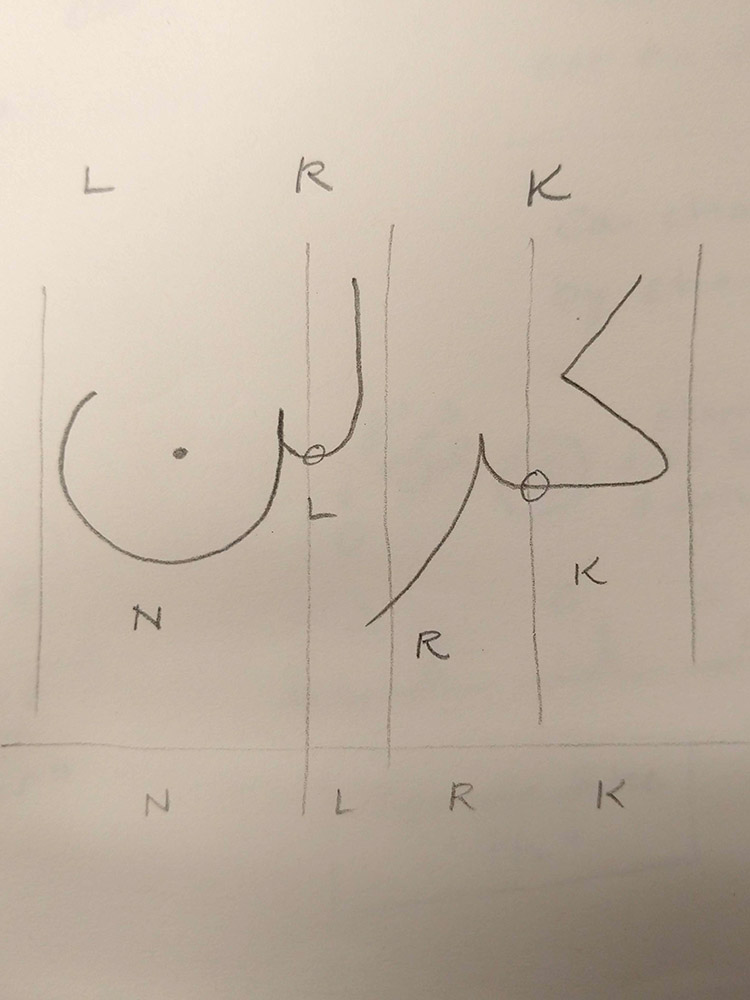
Once we went through the alphabet, Maryam tested our knowledge by having us write our name on the whiteboard. “Carolyn” appears as “NLRK,” or “KRLN” when reading from right to left. Vowels are only used when they appear at the beginning of a word, hence the missing A, O and Y.
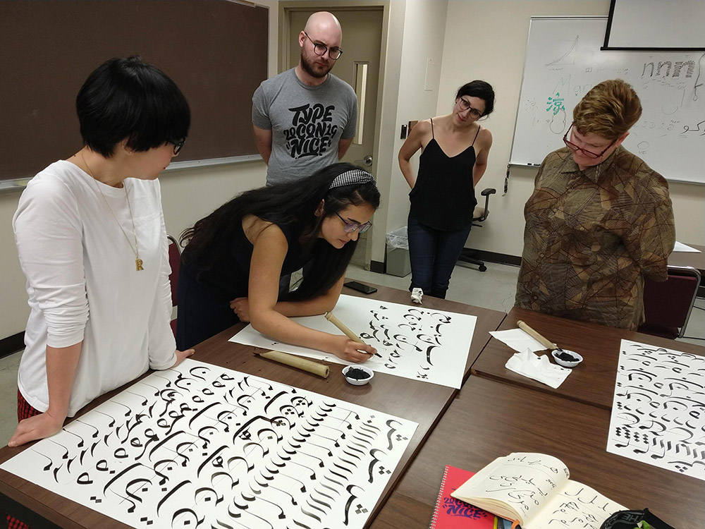
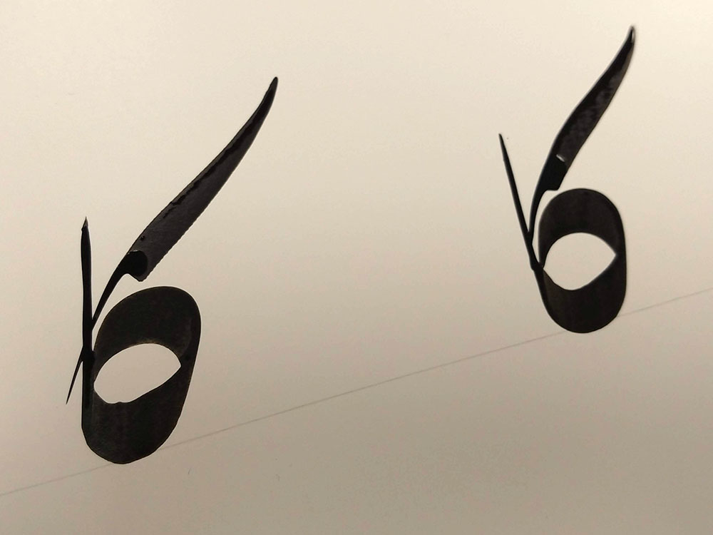
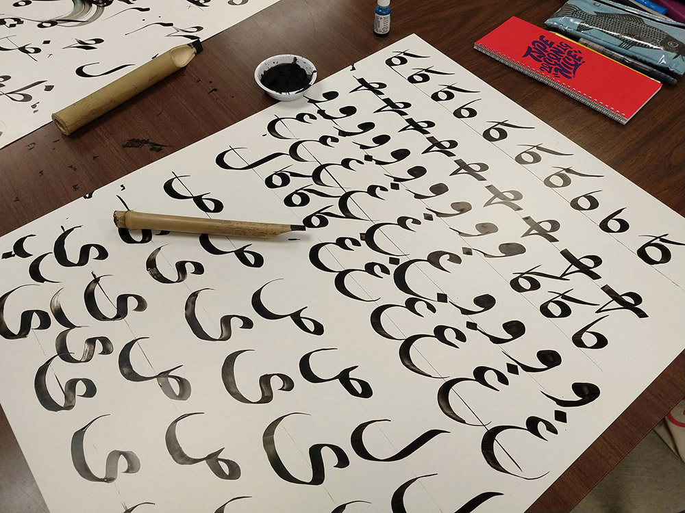
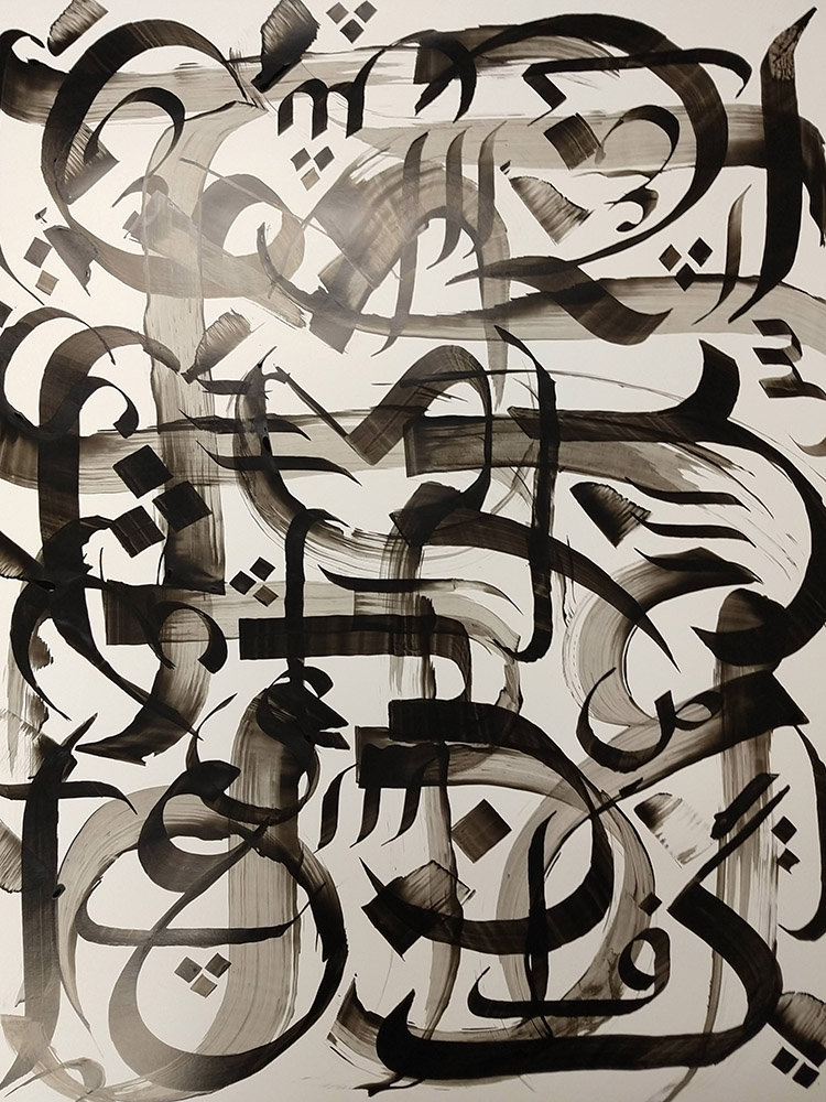
Next, Maryam gave each of us a chunky bamboo pen, cut by a friend of hers to have a nib with a 30˚ angle, a bowl of ink-saturated cotton, and large pieces of poster board. We attempted to replicate the loops, lines and dots of individual letters in the Nas’taliq style. Some lettershapes came easily. Others, such as an angled aleph that Maryam effortlessly made look like a feather with a last-second twist of the nib, I was never able to properly replicate. (You can see Maryam’s feather-shaped aleph in one of the photos above.)
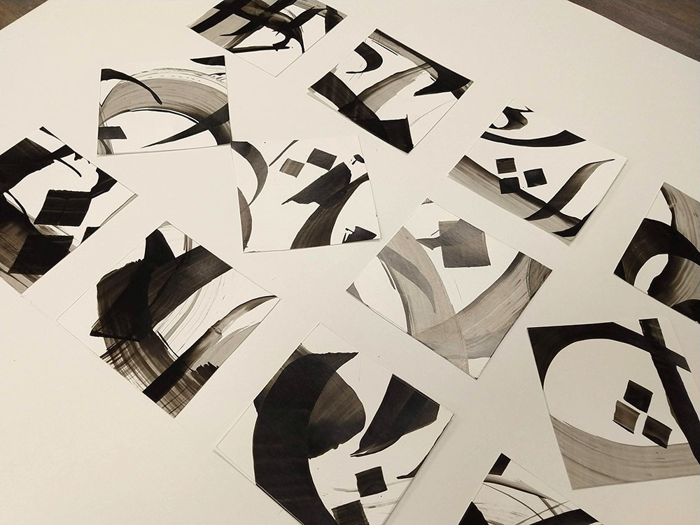
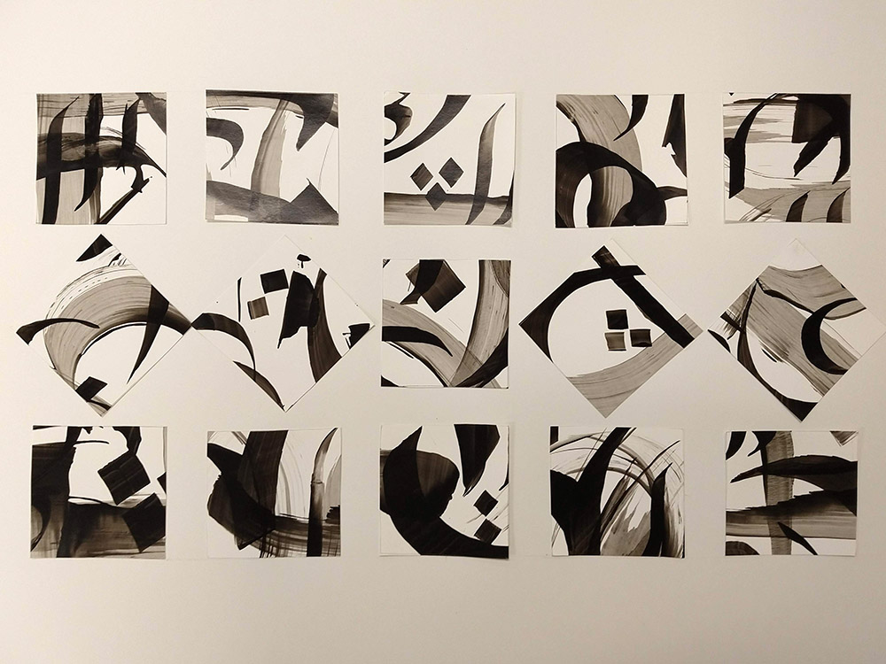
After a quick break for lunch, Maryam had us practice lettershapes by creating an abstract composition on a fresh sheet of poster board. It was fun to layer letters and to use other tools (brushes, erasers, even a folded styrofoam plate) to create broad, expressive strokes. Once the compositions were complete, she had us identify and cut out the most interesting sections, then re-compose small squares and rectangles into an abstract piece of art. It felt great to spend a day off the computer, get ink on my hands, and play.
One fun bonus was that a friend in the type world, Erin McLaughlin, who specializes in fonts for Indian and south Asian languages, was also in the workshop. Erin summarized the day perfectly: “Maryam’s workshop was like exposure therapy for a neurotic, perfectionist, digital media-based person like me. I need to do this more often!”
———
I enjoyed learning about the lettershapes, but I already have typographic projects on my plate, so I don’t foresee continuing practicing Nas’taliq calligraphy. But the workshop was a delightful way to kick-off my TypeCon conference experience and to learn more about this beautiful calligraphy. Maryam’s passion for the style was evident, and I love workshops where the only requirement is curiosity and an open mind.